How to take the perfect head shot
Whether it’s for social media, your own website or just for fun, a great head shot should reveal your personality, and with these simple techniques you can nail it every time, writes Dom Salmon
The selfie. It’s probably the most ubiquitous photo in the world. The arrival of the smartphone with a front-facing camera launched billions of pictures of people in front of everything from the Taj Mahal to the local café. These photos are now attached to your ‘digital life’, from Instagram and Facebook to TikTok and X (formerly Twitter) and act as a sort of guarantee that you are… you.
Fun, simple and everywhere, but what if you want something a little more professional? For your LinkedIn account, for example? Maybe that photo of you dancing on a table singing a Dua Lipa song doesn’t quite have the right ‘pro’ vibe?
The good news is that, even the smallest room, you can get a great head shot very quickly and very easily.
There’s no ‘right’ way to take this kind of photo. Two great head shots may be completely differently lit, composed and framed. One person may look happy and smiley, the other serious and professional. Very different. Both great.
The main thing that every great head shot has is that it shows the personality of the subject.
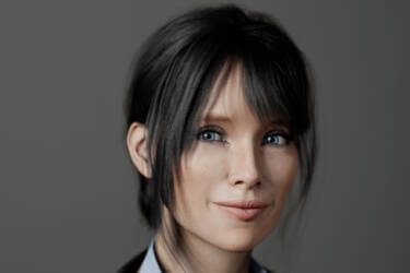
But there are a lot of wrong ways to take one. So, what does ‘wrong’ look like? Well for that, let’s meet our digital guinea pig Jessica, set up in a virtual studio environment where you can control lighting, camera, lenses, settings and all the rest.
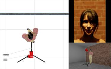
Jessica wanted to take some pictures for her online CV but oops! The above is less young professional and more character in the latest Paranormal Activity film. So, what is Jessica doing ‘wrong’ in this photo above?
In her set-up, Jessica has just used the light in the room. It’s a single lightbulb and she’s standing pretty much underneath it. As you can see, this very heavy top light means her eyes are completely shaded. It’s also a very ‘hard’ light, meaning the shadows are also super sharp and nasty. And the tungsten quality of the light is very ‘orange’ and unnatural looking.
Jessica has also shot against a brick wall. Now that’s great for loft living, but here it’s a distracting detail. Immediately people will be thinking, ‘Where is that, is it outside? But then where’s that light coming from?’
There’s load of ‘headroom’ to the shot, too, and she is wearing an off-the-shoulder top. Again, someone looking at this will be thinking, ‘Is she really short?’ or even, ‘Is she naked?!’
Also, the very ‘head-on’ pose looks unnatural and more like a passport photo pose.
This is an extreme example to illustrate a point, but you can see how several small ‘wrongs’ can quickly add up to one big ‘What the…?’ in a photo.
Let’s get Jessica to try again. Now she’s bought a plain photo background, a flash unit and a smart jacket. The results look a bit more ‘professional’, but are still not very flattering. Again, there are mistakes happening that are distracting us from her picture. So, what’s going ‘wrong’ in this set-up below left, it’s certainly an improvement from before (below right)?
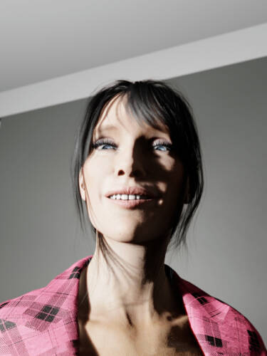
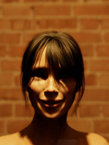
To be fair, Jessica has fixed some issue from her previous attempt. You can see more of her face and the plain background is less distracting. We no longer think she’s unusually short and she’s obviously got clothes on. So, better, but why are we still getting ‘distracted’ from seeing her personality?
First up, flash is great, as it’s a powerful beast for pumping out a ton of light on to a subject. But it’s a beast that needs taming! Here, Jessica has put the flash at head height, with no ‘modifier’, so it’s still a very powerful, hard light. The shadows are still very harsh on her face, and it is also producing a strange shadow in the background, as if someone is standing behind her.
Angle-wise it’s a bit better as she has turned herself slightly but, by using a very wide angle, and shooting ‘up’, we’re seeing up her nose and the face looks wide and distorted. Again, unflattering. The shooting angle also means that the top of the photo background is a distracting detail.
Lastly, the choice of jacket is very distracting, and the unusual crop makes her look as if she’s wearing nothing underneath it.
Again, extreme examples. But, again, not a result you’d want the world to see.
So, does our heroine throw in the towel and email a local photo studio?
Follow the rules
No! Jessica is willing to give it one more try. But does that mean buying lots more kit? A different flash. A new camera even? Mercifully, no. With a few ‘rules’ to keep in mind, Jessica can start to think less about getting the shot and more about letting her personality show through.
Download SnapBridge
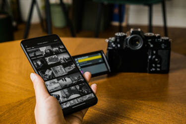
Nikon’s SnapBridge app is a must when taking your own picture. It allows you to use your phone to change settings on your camera, such as shutter and aperture, fire your shutter and even see the photo you’ve just taken, all from the other side of the room.
It’s a real momentum killer to have to set a timer, run back to your spot, strike a pose, then run back and review that picture on your screen. So don’t do it. Download SnapBridge instead here.
Get a friend to help
Top tip: get some nice biscuits and invite a friend over. Head shots are a hundred times easier with someone else on hand to help.
You can try them out in different poses and set-ups before you start doing them yourself. It’s the same with a professional shoot. Without an assistant, I have to guess everything before the subject arrives. With an assistant, I can spectacularly fail with a dozen set-ups before they’ve even got there! But at least I know what doesn’t work.
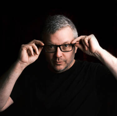
Once you are in the frame, a second person is really useful, too. From spotting stray hairs on your face or a missed button, to holding a reflector, checking if you’re standing up straight, or making you laugh for a spontaneous pose – they can help you stay relaxed. And a relaxed, confident subject is probably the single most important thing in any head shot or portrait. You can see mine below!
Make use of soft light
Outside of edgy fashion shots, hard, powerful light is simply not your friend. So, use a modifier (like a softbox, brolly etc.) to take the sting out of your light source. If you don’t have one, a friend holding tracing paper in front of a light is surprisingly effective. And don’t put your light head-height and pointing directly at you front on. In our everyday lives, we’re never lit like that. It’s usually from a window or the sky, so the ‘rabbit-in-headlights’ look is always very noticeable.
That said, you can use ring lights, which are popular with influencers for their photo and video content, especially those demonstrating makeup and beauty products. Why? Well, yes, they are a ‘head-on’ light, but the very even circular light that surrounds the lens is usually low-level and very diffuse. This gives a flattering, even light and, as a bonus, cute little hoop-shaped highlights in the eyes. It works great for video, as it means you can move around and have a consistent, even light. To my mind it’s a little flat for stills, though, as a safety-first option, it can be very useful (and very inexpensive).
Lastly, if you don’t have a flash or LED light, don’t forget windows are big, bright, soft light sources – and free!
Pick the right focal length
Wide-angle lenses are very unflattering for head shots. Your ears look enormous, and you’ll think, “Is my nose really that big?”. It’s all very ‘smartphone selfie’, which is exactly what you’re trying to not do with a professional-looking shot. So, as a rule of thumb for portraits, the longer the focal length the better. The 85mm is a classic portrait focal length and I’m a huge fan of the NIKKOR Z 85mm f/1.8 S, to the point that I wonder when I last took it off my camera. The new NIKKOR Z 135mm f/1.8 Plena is simply amazing, too, for bokeh, but you don’t need to go pro. If you have a zoom like the NIKKOR Z 24-70mm (either f/4 or f/2.8) or the NIKKOR Z 70-180mm f/2.8, you’ll find the more above 50mm you go, the more natural your shot will look. For DX users (Nikon Z 30, Z 50, Z fc), the NIKKOR Z DX 18-140mm f/3.5-6.3 VR is the perfect option, as a 50mm set on a DX lens is the 80mm full-frame equivalent.
Open your aperture
Remember the most important thing in any head shot is, you guessed it, the head! Or, rather, the face. The less distracting you can make anything else in the shot the better. Get your aperture open wide to make backgrounds and other details soften and fall out of focus. However, you don’t have to use a totally plain background. Some sense of setting or location (e.g. an office) can help ‘place’ a shot. Just make sure it doesn’t get in the way and be a distraction.
If that narrow focus window makes you nervous, just switch on your eye-tracking autofocus. Even with a longer lens, your Nikon will keep key elements in focus. With a big aperture, say 2.8 or wider, your eyes will be tack sharp, but your ears will nicely fall to a softer look. It’s a classic portrait look that really focuses attention on the face, and thus the person behind it.
Don’t forget the details
So those are the big-ticket technical things to think about, but here are some other pointers that will make life easier.
- Neutral colours work better for clothing, as they don’t distract from the face. There’s a fine line between fun and annoyingly zany in your outfit.
- Use masking tape! Or at least something like a Post-it to mark where you’ve worked out your final spot, not just for you, but also for your camera and any lights. It’s very important, like an actor, you know where your ‘mark’ is.
- Don’t even try this without a tripod. Even if you have a friend on hand to shoot for you, until you get the hang of all the moving parts in a portrait set-up, keeping the camera at a fixed point will speed things up no end.
The final shot
So, what do those pointers all mean for Jessica? Is three times the charm? Let’s see how she’s getting on.

Big improvement! So, what’s the difference? Not a lot in what she did, but certainly
in the result!
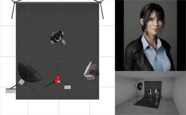
Here are all the simple changes Jessica made to get a hugely improved shot:
- Modified her light with a diffuser so it’s no longer a harsh ‘hard’ light. It’s also been moved further back and raised higher. We still have some shadows, but there’s now a much more natural, three-dimensional feel to the picture. She’s almost replicating what a nice big window would be doing. This softer light also means her skin looks smoother and has lost a lot of its shine.
- Jessica asked a friend to come over, and here, they’re holding a simple reflector to put about a quarter of a stop of that light back on the non-light-facing side of Jessica’s face. Effectively, the friend is mimicking the ‘fill’ light of a multiple light set-up that takes a little ‘depth’ out of the shadows. When you A/B this set-up and without the reflector, you’d be amazed how such a subtle difference can make such a big difference.
- By moving the whole set-up away from the backdrop, she’s lost any shadows or interference from it, so we can just concentrate on her.
- By giving herself space, and raising the camera height, it’s a much more flattering and natural-looking angle she’s posed at. Her slight turn to the camera is now more subtle and she’s really maximising the eye contact with the camera and, thus, the viewer.
- Changing outfits has kept the focus totally on Jessica’s face. As she has quite pale skin and black hair, she’s added a shirt that isn’t distracting. It also looks more professional, though still has a slight casual feel to its style.
- By using a longer focal length of 85mm, coupled with a f/2.8 aperture (previously it was f/8) several things have happened. The face now has a much more flattering look. If we zoom in…
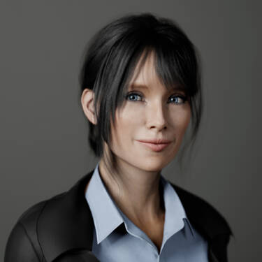
…you can see the eyes (the most important part of any headshot), nose, lips are all beautifully sharp. However, the ears and back of the hair are starting to nicely fall off to a beautiful soft effect.
Also, in this close-up, you can see the reflection of the flash in both eyes. These kinds of reflections always add life and vitality to shot, and so to the whole picture in general. In fact, without them, eyes can often look dull.
You will become obsessed with these reflections. Any picture you really like, check the eyes! The secret to how the photographer used light in that photo is right there! And once you’ve seen them, you’ll never unsee them.
Don’t be afraid to shoot with a bigger frame around your subject and crop in to suit where you will be using it. From the same frame, Jessica has got a great medium close-up shot, but there’s also an intimate and very up close and ‘present’ square frame she can use, too.
Lastly, because Jessica had more information and guidance to follow, she only had to spend a small amount on a modifier and a reflector to completely change her technical approach.
But most importantly, her friend came over to help. She was more relaxed, she had someone to help with the set-up, she could ask the friend’s opinion of set-ups and shoot a ton of shots of her friend to try different stuff out. It creates a totally different feeling ‘on set’ and that’s true for any location, from a photo studio to the smallest bedroom. It’s one of the biggest differences to the whole vibe of what you do, and it always shows. A confident and relaxed feeling will shine through in any picture.
Digital she may be, but Jessica now looks like a confident professional with her new photo.
Using these techniques that help remove the technical obstacles to getting the shot ‘right’ means you can concentrate on relaxing and revealing your personality.
So that’s your digital ID picture done, what’s next?
Well, when you can take a great headshot, you can look to taking great portraits. You have the technical skills in the bag now, so you can start telling a great story about your subject.
That’s when everything gets even more exciting.
Disclaimer: The images of Jessica are rendered for illustration purposes and are not real photographs.
Better images start here
Featured products
More by Dom Salmon
Unlock greater creativity


